Microsoft Power BI is a business intelligence (BI) platform that provides users with tools for aggregating, analyzing, visualizing and sharing data. Power BI’s user interface is fairly intuitive for users familiar with Excel and Power query, and its deep integration with other Microsoft products makes it a versatile self-service tool that requires little upfront training.
Whether you are new to Microsoft Power BI or an experienced user, Power BI can help achieve your professional goals in a number of ways. I have listed the objectives as follows.
- Creating reports and dashboards that present data sets in multiple ways using visuals.
- Connecting various data sources, such as Excel sheets, onsite Datawarehouse, and cloud-based data storage, and then transforming them into business insights.
- Providing company-wide access to data, data visualization tools, and insights in order to create a data-driven work culture.
There are free and paid versions of Microsoft Power BI available. The free version, i.e., the Power BI Desktop can be downloaded for free to create rich and interactive reports with visual analytics. However, publishing and sharing the final report is not possible with the free version. For this, the Power BI Pro or Power BI Premium version needs to be used. The Power BI premium has all the features of Power BI Pro with extra features like advanced AI, dataflows, refresh rate etc. Refer to the link for a detailed comparison of the various version features.
Creating a Microsoft Power BI Dashboard
In this blog post, I’ll walk you through the stages of creating a basic Power BI dashboard. Given that the free edition of Power BI has been downloaded and installed on your PC, the next steps are as follows.
From the start menu click on Power BI Desktop icon to start the Power BI application. Once the application is started below is the screen that appears. Click on “Get Started” button at the center of the screen.
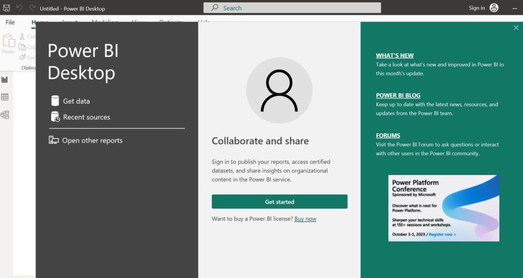
In the next screen, there will be a pop up that asks the user to enter his/her work email address in order to access the organizational content. Currently since the free version is being used, this step can be skipped by clicking on cancel button.
Sections of the Power BI Tool
Once you have successfully started the Microsoft Power BI application, following is the screen that shows up wherein you will be performing all the actions w.r.t report/dashboard creation.
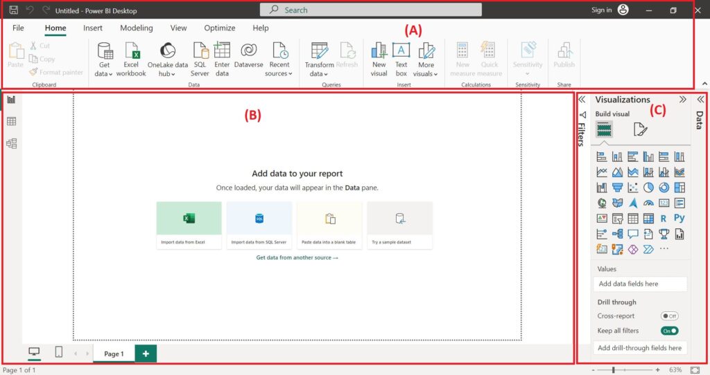
The top most section (A) is the ribbon area wherein you will find all the options from loading the input file to performing analysis on the data. The section (B) is where you can see the contents of the input file to the final visualization of the data in various forms. The section (C) is where the various visualization options can be selected and the data parameters that needs to be displayed on section (B) can be selected.
Importing & Cleaning the Data
Now that you are familiar with the sections of the tool, the next step will show you how to import & clean the data file/s needed to create the dashboard.
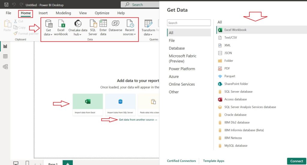
The raw data can be imported in either of the three methods as indicated by the right arrows in the above figure. Just click on either of the options to import the data. The file types that can be imported are as shown in the right side of the above figure, indicated by the down arrow.
Let us consider that we have two raw data files to import ,i.e, an excel file and a text file. To start with, the excel file that consists of 2 sheets is selected and imported. After the file is imported the below navigator window will pop up as shown in the below figure.
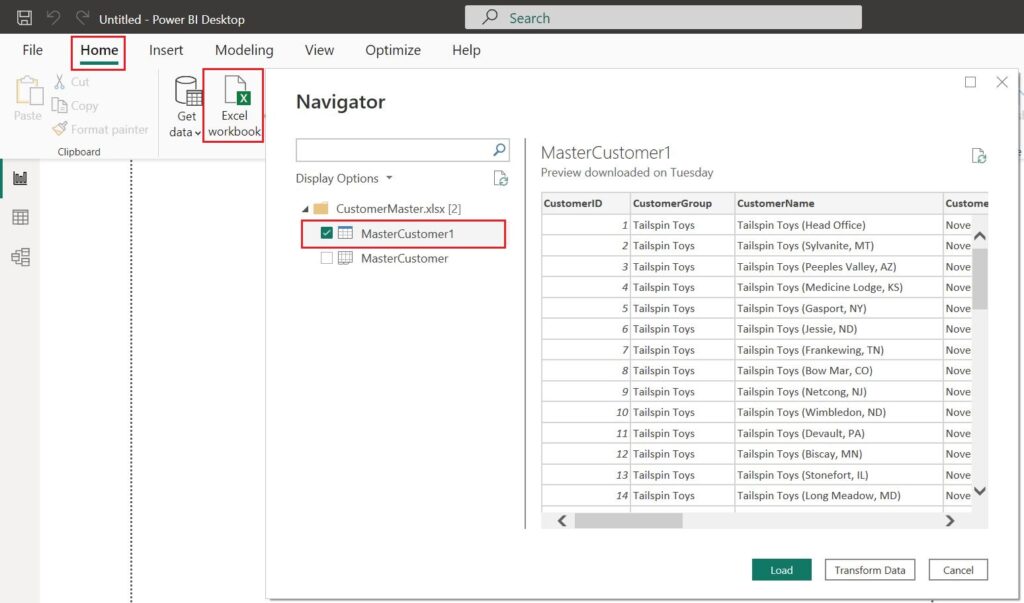
Of the 2 sheets let us consider the “MasterCustomer1” sheet for further analysis. At this point we have 2 options, i.e, either to load the raw data directly in case of no cleaning needed or transform data in case cleaning of the raw data is needed.
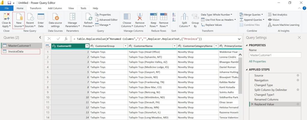
Let us consider that data cleansing is needed due to which we have to click on “Transform Data” button. Now the Power Query Editor window opens, using which we need to perform the necessary data cleansing tasks. In case of data cleansing task in the next file as well, you can directly add the file to the Power Query Editor window as shown in the figure below using the option Home > New Source > File Type.
Once the data cleansing/wrangling task is complete, the next task would be to load the files onto the Power BI Desktop Editor using the “Close & Apply” button next to the “New Source” button.
Data Visualization & Exploration
In the next step, the imported and cleansed data needs to be used to create visualization, on which further analysis can be performed.
As seen in the Report view up top, the right side of the screen contains the imported and cleaned data. Here we are using data in both the files to create a visualization. However both the data files need to have a common link in order to create visualization. This common data between both the files is depicted in the Model View as shown below. The Power BI AI capability automatically detects the common data between both the files. This auto detect feature can be turned off under the File > Options and settings > Options > Data Load section.
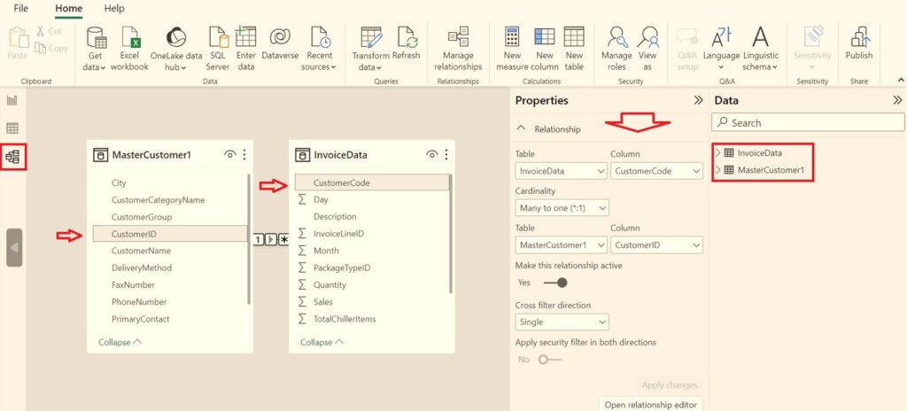
As you can see from the above figure, the common data between both the files is the “CustomerID” column in the MasterCustomer file and “CustomerCode” column in the InvoiceData file.
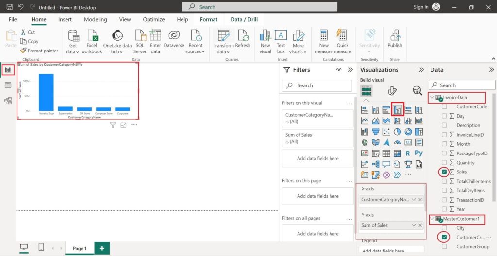
Moving back to the Report view, in the below figure you can see various kinds of visuals of the data in addition to the bar chart.
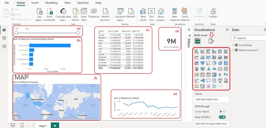
The data visualization in the dashboard above is implemented as;
- (a) Slicer
- (b) Bar Chart
- (c) Table
- (d) KPI Card
- (e) Line Chart
- (f) Map Chart & Text Box
Slicer display is easy. Just select the Slicer icon under visualizations pane on the right, then select the data from one of the two data files that you want to display as a slicer and you are ready to use the slicer functionality.
Bar Chart & Line Chart display is easy too. Just select the Bar/Line/Column/Area Chart icon that you want to use. Once you’ve selected the x axis and y axis data that you need to analyze, your data is ready to view.
The Table visual is used to analyze data as well. As shown in the above figure, the Month and Sum of Sales are the ones from the data files, but the remaining columns are from the calculations option the shows up after clicking the Quick measure button on the Home menu ribbon. In case your measure parameter does not exist under the Calculations drop down, you can describe the measure and Power BI will generate the DAX formula that can be customized. However, this is available on the licensed version only.
Clicking on the Card icon in the visualizations pane will bring up the KPI Card. After clicking the button, choose the KPI parameter to monitor from one of the two data files.
Finally, to display the Map Chart, pick the Map Chart icon from the visualization pane, followed by the KPI parameter and the location parameter from the data files.
In the visualization pane, there are many more visual options that you can use to create a dashboard according to your requirements.
After completing the dashboard, the next step would be to share the visualization report with the concerned. The Publish option is not available in the free version. The other way to share the report is by sending the Power BI report file “*.pbix” itself. However, you can also share a static report by exporting it to PDF using Export to PDF option. One more method is to use a screen capture tool to take a screenshot of the report.
Tips & Tricks
- Q&A: This AI feature of Power BI will be helpful to provide insights to your imported data. You can access this feature from either the visualization pane or from underneath the Insert ribbon. You can input your questions in plain text format to get a response.
- Smart narrative: This AI feature can summarize the whole report in a few sentences. Thus, using this feature reduces the manual work of entering the key takeaways that can now be performed automatically. You can access this feature from either the visualization panel or from underneath the Insert ribbon.
- Analyze: This option is useful for further analyzing a bar/line chart. Just right click on the area of the chart that you want to analyze. Navigate to the Analyze option ,i.e, Analyze > Find where this distribution is different or Explain the increase/decrease to further analyze the data.
- Further Analysis: The analytics tab is shown by the magnifying lens symbol next to the visualizations pane. This tab gets displayed whenever the chart that needs to be analyzed is selected. Adding a min, max, average and other lines for further analysis can be set here.
- Wallpaper: By selecting the Format page tab adjacent to the visualizations pane, you can change the report background.
- Page Navigator: When the report has multiple pages, this feature will be helpful. Navigate to the different pages of the report by a single click. You can choose to automatically add buttons to your page by navigating to Insert>Button>Navigator>Page navigator.
- Lock objects: Any or all images on the report can be rendered immobile when the report is locked. Select the Lock objects option by navigating to the View ribbon.
- Align objects: Any or all the visuals on the report can be aligned by a single click. First, choose the visual/s that you want to align and navigate to Format>Align to align the object/s appropriately.
In this blog, i have only covered the basics of getting started with Power BI. Make sure to check out my future blogs for more information on this topic.
References :


Leave a Reply