
In one of my previous blogs i had detailed upon dashboard creation using MS Excel. Here, i will be focusing on the Google Data Studio dashboard creation. MS Excel, Google sheets are spreadsheet programs that can be used to capture, organize, analyze and report on tabular data. Whereas Google Data Studio(GDS) is a tool for creating interactive dashboard reports based on data from different sources including spreadsheets. GDS can be used free of cost by making use of your google mail id. It is just a data visualization tool and cannot be used for data capture, organize and analyze purpose.
Basics
Before starting with the visualization reports, let me take you through the basics steps that is required to know in order to get started. You can see in the below picture, the home page of Google Data Studio that can seen once you login using your google email id.
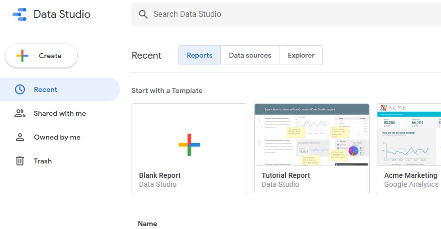
On the left hand side you can see items such as Recent, Shared with me, Owned by me and Trash. These indicate recently created reports, reports imported from external source, reports created by me and reports moved to trash respectively. Once you click on the Create button on the left side, you get options to create a report, data source and Explorer(BETA). Explorer is a new tool designed to help find insights faster. You can access the Explorer from any report to start exploring your data without modifying your report.
Create a Report using Excel/CSV File
First let us look into creating a report using an excel file as the input data source. See to it that you have your data in a tabular format with headings. Open your excel file and save it as a csv file. Once the csv file is ready, navigate to your GDS home page and click on Create > Report . In the next screen we get a pop-up Add data to report with multiple data source connector options as shown below.
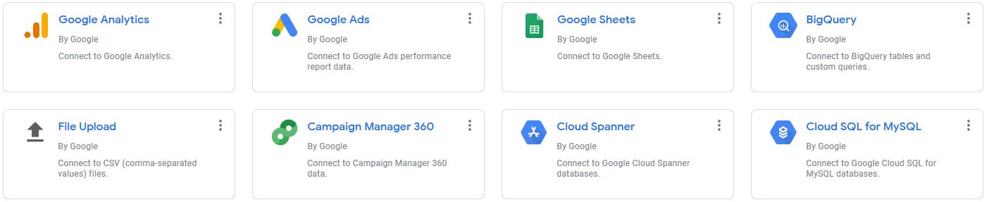
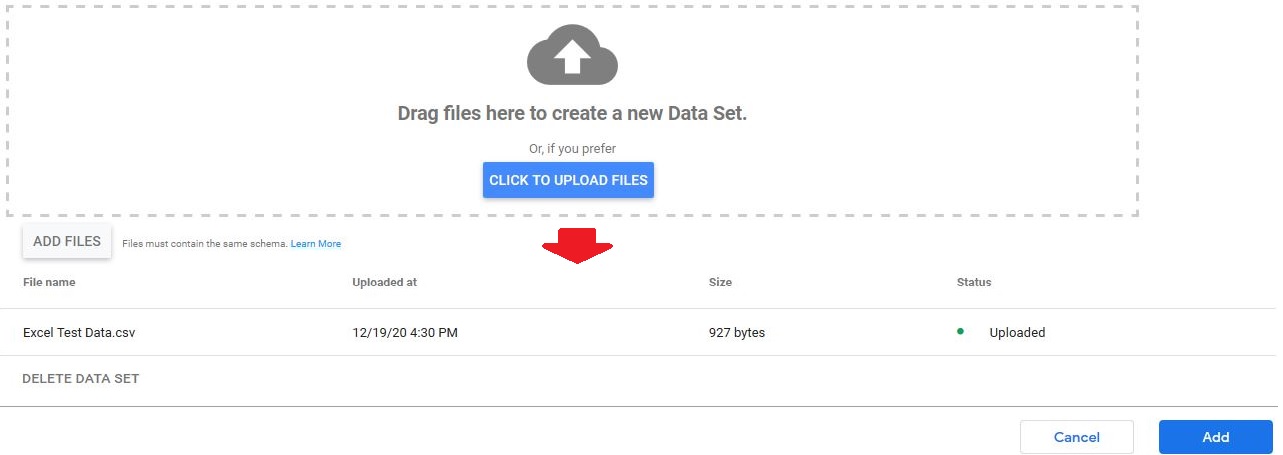
As you will be uploading a csv file, click on the File Upload connector that will in-turn open the following window. Click on the CLICK TO UPLOAD FILES button and select your csv file to upload. Once the file is selected, you can check the status of the upload as shown in the lower part of the below picture.
Click on the Add button. You will get a pop-up to confirm that the data you just uploaded will be added to the report, just click on ADD TO REPORT and your Untitled Report page will open. Rename the page appropriately (For ex: Excel Test Data). On the right side of your report you have options to set the Theme and Layout. Click on the Layout tab to set the canvas size and you can select your appropriate theme under the Theme tab. Before we start with the dashboard i will give an introduction about some of the features that will be handy when working on the tool.

The Add a control drop down button as shown in the above picture can be used to add a Drop-down list, Date range control box etc to your dashboard. The Add a chart drop down button can be used to add a Scorecard, Table, Chart varieties etc to your dashboard. The above features can also be accessed from the Insert menu option. The Add data button can be used to access the connectors in-order to add any extra data required if any. Other buttons like Add a page, Image, Text, Line, Shape etc can be used as and when required. One more notable feature is that, once the dashboard is complete, the View button on the right side can be used for preview. Below is the preview of a sample dashboard.
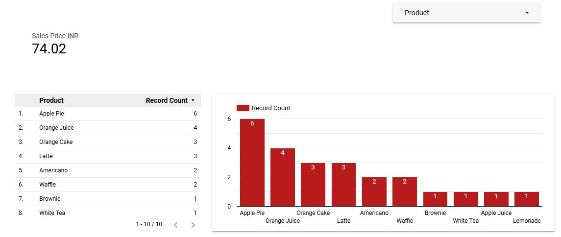
In the above dashboard, the Product box on the top right was created using the Drop-down list option. The Sales Price INR display was created using the Scorecard option. Lastly, the chart was created by selecting the Column chart option. The colour and other dimensions of the chart or any other dashboard item can be customized by first selecting the item and then navigating to the DATA / STYLE tab on the right. Additional pages can also be added if needed.
Create a Report using Google Sheets
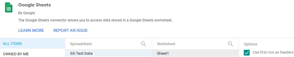
Now i will guide you through the steps to generate a report using Google sheets data. Once you login to Google data studio, navigate to Create > Data source that will open the connectors sheet wherein you need to select the Google sheets connector. On selecting the connector you can see the below screen wherein you need to select the appropriate spreadsheet, worksheet to work on. Once selected, click on the CONNECT button on the top right.
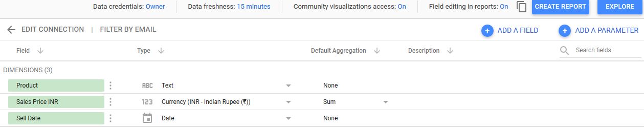
This is the next screen that you will get to see wherein you can edit the type and other information of the table items. Once everything is checked, click on the CREATE REPORT button and your untitled report page will open.
From here the steps are similar to that explained in the above Excel report section. Name the untitled report page appropriately and design your dashboard similar to the one above or any other of your choice.
Create a Report using Google Analytics
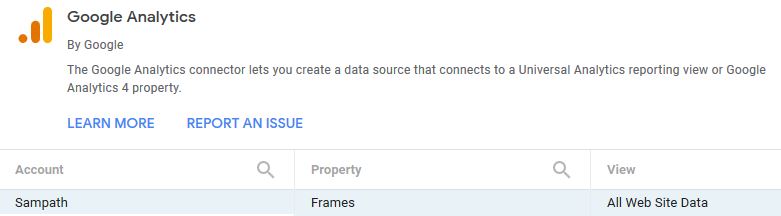
In this section i will be guiding you on how to connect your website data through Google Analytics. Navigate to Create > Report. You will get a pop-up Add data to report with multiple data source connector options wherein the Google Analytics connector will be present. Select the connector and if you have installed Google Analytics on your website your account will show up as shown in the below picture. Select your account, property and view and click on the Add button at the bottom.
You will get a pop-up to confirm that the data you just selected will be added to the report. Just click on ADD TO REPORT and your Untitled Report page will open. Name your report page appropriately. Below is the dashboard report preview that i have generated for my blogging website.
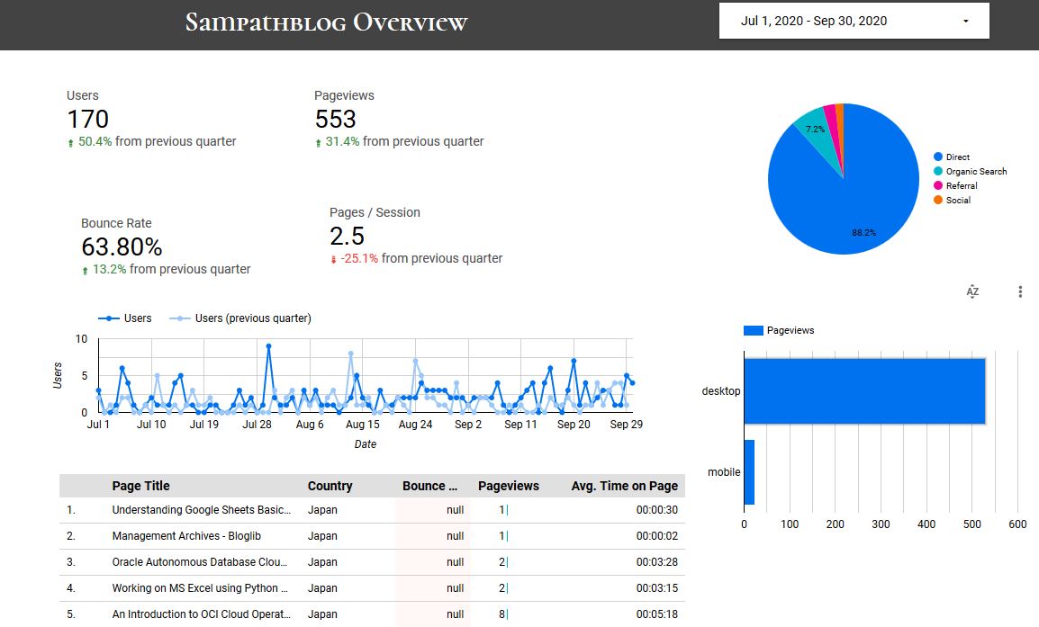
In the above dashboard i have used the scorecard option to create the display for Users, Pageviews, Bounce Rate, Pages. I have used the Pie chart, Time series, Bar charts options also under the Add a chart drop down to create the charts in the above display. Column items in the table can be added or removed by utilizing the Metric option under the DATA tab on the right. Any other customization to any item in the dashboard can be done by first selecting the item and then using the DATA / STYLE tab. Finally, the header part of the dashboard can be created by just selecting the Rectangle under Shape drop down button and coloring it black. Date range control option under the Add a control was used to select the date range. The text display in the header area can be done by using the Text button.
Further Reading :


Leave a Reply