Introduction
With the flood of data available to businesses these days, companies are turning to analytics solutions to extract meaning from the huge volumes of data to help improve decision making and boost businesses across industries.
Data analytics is a process where large sets of data are examined.It can be used to optimize marketing, exploit new opportunities for revenue, increase the quality of customer service, improve employee productivity and promote the efficiency of operations. This information can also be used to create competitive advantage over your rivals.
Looking at all the analytic options can be a daunting task. However, luckily these analytic options can be categorized at a high level into three distinct types. No one type of analytic is better than another, and in fact, they co-exist with, and complement each other:
• Descriptive Analytics-
Data aggregation and data mining methods are used to provide insight into the past and answer: “What has happened?”. The vast majority of statistics we use fall into this category ,i.e, reporting which provides historical insights into the company’s production, financials, operations, sales, finance, inventory and customers.
• Predictive Analytics-
Here statistical models and forecasts techniques are used to understand the future and answer: “What could happen?”. These statistics try to take the data that you have, and fill in the missing data with best guesses.Predictive analytics can be used throughout the organization, from forecasting customer behavior and purchasing patterns to identifying trends in sales activities. They also help forecast demand for inputs from the supply chain, operations and inventory.
• Prescriptive/Optimization Analytics-
Optimization and simulation algorithms are used to advice on possible outcomes and answer: “What should we do?”. This is a relatively new field and is all about providing advice.These analytics go beyond descriptive and predictive analytics by recommending one or more possible courses of action.Prescriptive analytics use a combination of techniques and tools such as business rules, algorithms, machine learning and computational modelling procedures against input from many different data sets including historical and transactional data, real-time data feeds, and big data.Prescriptive analytics are relatively complex to administer, and most companies are not yet using them in their daily course of business.
Especially in today’s era of big data, we might be forced to think that Hadoop, R and the other latest technologies might be used by the majority. But the fact is Excel Spreadsheets are the most commonly used tool in the world. A recent survey, from 2009, showed that spreadsheets are the fourth most common task that people do at their job on the computer, after using Internet and word Processing, so it’s really common. And what happens often is that spreadsheets are designed as a one-time solution, you might think I’m only going to use this spreadsheet for this one report. You just download the data, make a graph and this is where it will end. But as per research, spreadsheet has a very long life span of equal to or more than 5 years during which multiple people may be using it.
Analyzing the Data
We will start with a data source which can be a database, or an export from a register system, but sometimes we may get the raw data directly by email from the requester. Anyways, from a data source, we will learn how to import that data into Excel and wrangle that data. So, we will be learning how to go from raw data to data that is easily processable. From here we’ll do analysis on the data such that we get a nice view on the data. Because if you have a large dataset, you want to make sure you’re looking at the right place. Once we have a view, we’ll learn to put graphs on top of it. Nice visualizations that make it easier for anyone to see what’s going on.
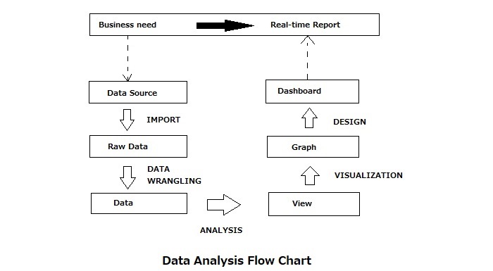
The above flow chart depicts the conversion of ‘business needs’, which may be anything like information on profits for a particular month, performance of a new product in the market etc into ‘real time reports’ so that we can have an instant access to required data anytime.
Combining, Importing & Cleaning the Data
Import from a CSV file
We are going to convert our CSV data to excel, and the first thing needed would be to have our source data in CSV format, a ‘comma separated values’ format. There two ways to do this, first is to directly ask the source to send it as a csv file. In case that is not possible, second way is to just open the file in excel and do the “Save As” to CSV file. Though we may get the message “Pivot tables and formulas will be removed if you convert to CSV” just ignore and complete the conversion.
Import from CSV
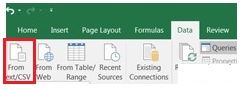
Now that we have the CSV file, we can start importing or loading from the CSV. As above, click the Data tab and then click the “From Text/CSV” button. Select your CSV file from the next window and click “Import”. In the next window which appears as below (A), we pick “delimited”, and we tell excel at our data has headers because the first row is a header row. And even though it’s called a CSV file, we still have to tell Excel that commas are the separators between the columns.
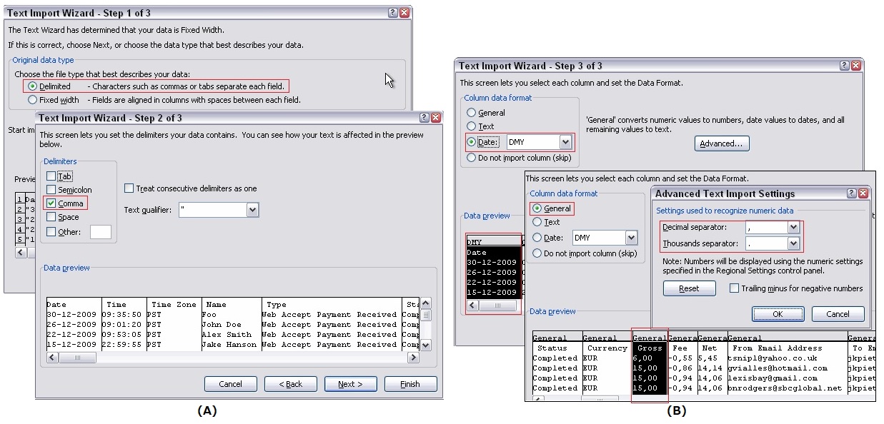
Text Import Wizard
So we get a nice little preview now, and here we can set the data types. So we say this is ‘text’ and this is ‘text’. And here we have a ‘date’. So we have to tell Excel: “be careful, this is a ‘date’!” and also say that it is month-day-year as shown in the figure (B). Then it knows how to interpret it.
After you finished defining all columns, click the Finish button. Excel opens the Import Data dialog, asking where to put the results. Select the proper location. After that it is important to click the Properties button to navigate to the External Data Range Properties dialog box. There are some very important settings to be made here!
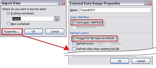
External Data Range Properties
Of all the red frames in the above dialog box , the most important one would be “Prompt for the file name on refresh” unchecking which, makes Excel to not prompt you for a file name each time you hit the refresh button when importing the same file over and over again. Click OK and we have the excel format data now.
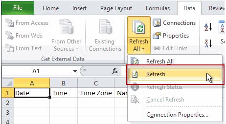
The “Refresh” option
In case we receive the updated file from the source again, all we need to do is open the excel and overwrite the existing CSV file. After saving the second file as a CSV we can just hit the “Refresh” from the “Refresh All” dropdown and the data will be loaded automatically.
Import from the web
If you’re going to import data from a webpage into Excel, the best format is as a table. Excel will import every table on a Web page, just specific tables, or even all the text on the page—although the less structured the data, the more that the resulting import will require restructuring or wrangling before you can work with it. One more important point to note here is that the data imported to excel can be synchronized to the latest webpage data by just hitting the “Refresh” button under the Data tab. Isn’t that great!
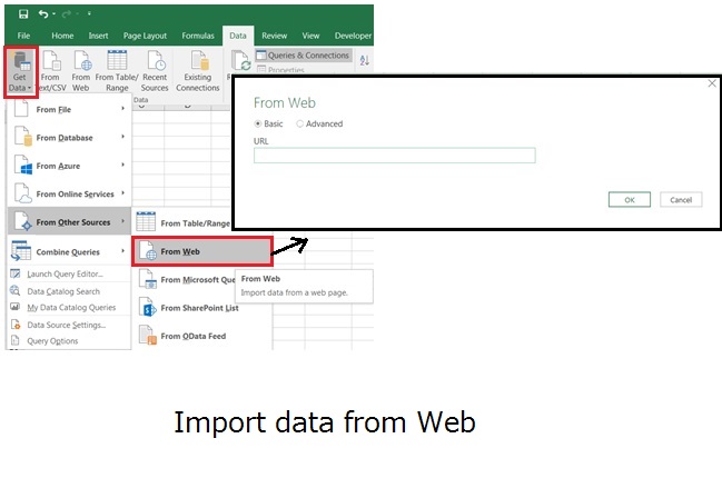
After you have identified the website that contains the information you require, import the data into Excel as follows :
- Open Excel.
- Click the Data tab and choose From Web after clicking Get Data drop down.
- In the dialog box, select Basic and type or paste the URL in the box. Click OK.
- In the Navigator box, select the tables you wish to import. Excel tries to isolate content blocks (text, tables, graphics) if it knows how to parse them. To import more than one data asset, ensure the box is checked for Select multiple items.
- Click a table to import from the Navigator box. A preview appears on the right side of the box. If it meets expectations, press the Load button.
- Excel loads the table into a new tab in the workbook.
Combine Data
Before we start with the import operation mentioned earlier, in case we have multiple source files we can import each file separately and make the data connection between them which would involve a lot of work. However, the better way would be to combine all the CSV files to form a single CSV and then import it. The most simple way of doing this would be to execute the following command on the command prompt rather than the cumbersome manual copy paste operation each time. The output of the below command would be the “input.csv” file which contains the data of each file one below the other.
C:\csv>copy *.csv input.csv
Data Cleaning / Wrangling
Once we’ve imported data, we’ve gone from a data source to the raw data. However, we need to cleanup the raw data as it requires some customization and has inconsistencies like blank cells, repetitive headers, text in place of numbers etc which needs to be sorted out before we start with the analysis of data.
In order to wrangle the raw data we can use functions like COUNTIF,ISTEXT,NUMBERVALUE,IF,ISBLANK,LEFT,RIGHT,FIND,MID etc.
Let me illustrate one of the data wrangling methods ,i.e, slicing of column data to extract a part of data in a cell as follows.
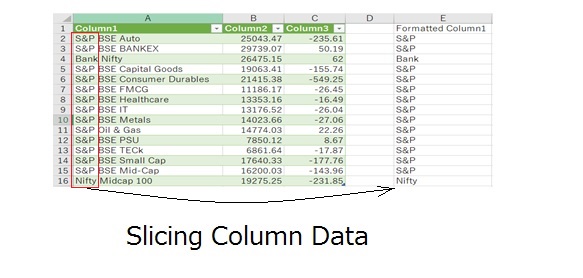
In the figure, the formatted cell column(E) contains the sliced data of column1(A). For this we have used the LEFT and FIND functions.
The whole formula is : LEFT(A2,FIND(“ ”, A2)-1)
Here the FIND function returns a numerical value of 4 including the space after S&P. So, -1 has been added to avoid the additional space character appearing in the output.
Data Exploration
There is a need from the business to know something specific like sale of an item in a city or something generic like “Is our company doing well” based on the data at hand, and that can only be answered by a real-time report. So it is our job to go through all the steps: importing the data, wrangling it, and then analyzing it. Not just analyzing it, but doing exploratory analysis.
Vlookup & Index-Match functions
When you want to pull information from a table or integrate the data from different spreadsheets, the Excel VLOOKUP function is a great solution. And, although VLOOKUP is relatively easy to use for small size data analysis, there is plenty that can go wrong. One reason is that VLOOKUP by default, assumes you’re OK with an approximate match. Which you probably aren’t.
VLOOKUP requires that the table be structured so that lookup values(what you are looking for) appear in the left-most column of the table we are looking in. The data you want to retrieve (result values) can appear in any column to the right. When you use VLOOKUP, imagine that every column in the table is numbered, starting from the left. To get a value from a particular column, simply supply the appropriate number as the “column index”.
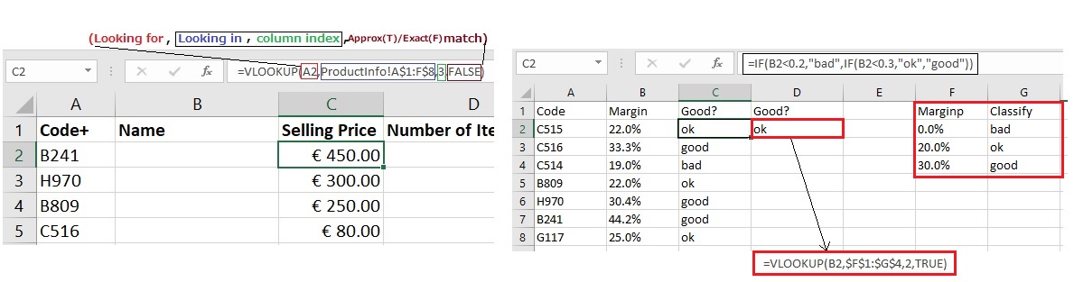
VLOOKUP function(FALSE, TRUE match cases)
One of the more interesting uses of VLOOKUP is to replace nested IF statements. If you’ve ever built a series of nested IFs, you know that as the length increases so does the confusion.You also have to be careful about the order you work in, so as not to introduce a logical error.Refer to the right side of above figure for the illustration wherein we use VLOOKUP for an easy implementation.
Suppose we are having a huge dataset with thousands of items.Then, our nice little VLOOKUP function , if we drag it down now, will take a long time. The spreadsheet will now remain slow because the VLOOKUPs will be calculated all the time as the input values change. Also in case of any typos the refresh again will take a lot of time. So, the first reason VLOOKUPs can be cumbersome is that they are pretty slow for huge datasets.
Another reason is that VLOOKUP is one way – starting from the first column, retrieve something that’s in a later column. There’s no way that you can go back in the stream with VLOOKUP function. It only works one-way! So these are two reasons that VLOOKUP functions aren’t perfect. If you want speed you will have to look in both the directions for which we have a separate function as explained below.
Apart from VLOOKUP, INDEX and MATCH is the most widely used tool in Excel for performing lookups. The INDEX and MATCH combo is potent and flexible.The MATCH function is designed for one purpose: find the numeric position of an item in a list. Whereas the INDEX function retrieves values at a given position in a list or table.
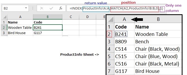
INDEX-MATCH function
Being faster in speed compared to VLOOKUP , the other benefit of using INDEX-MATCH over VLOOKUP is going back-stream as well which is illustrated in the above figure. So, for some scenarios INDEX-MATCH is better than VLOOKUP.
Pivot Tables, Charts & Power Pivot
The power of pivot tables is that, with little use of formulas we can analyze the data just by clicking and dragging.
Pivot Table and Chart
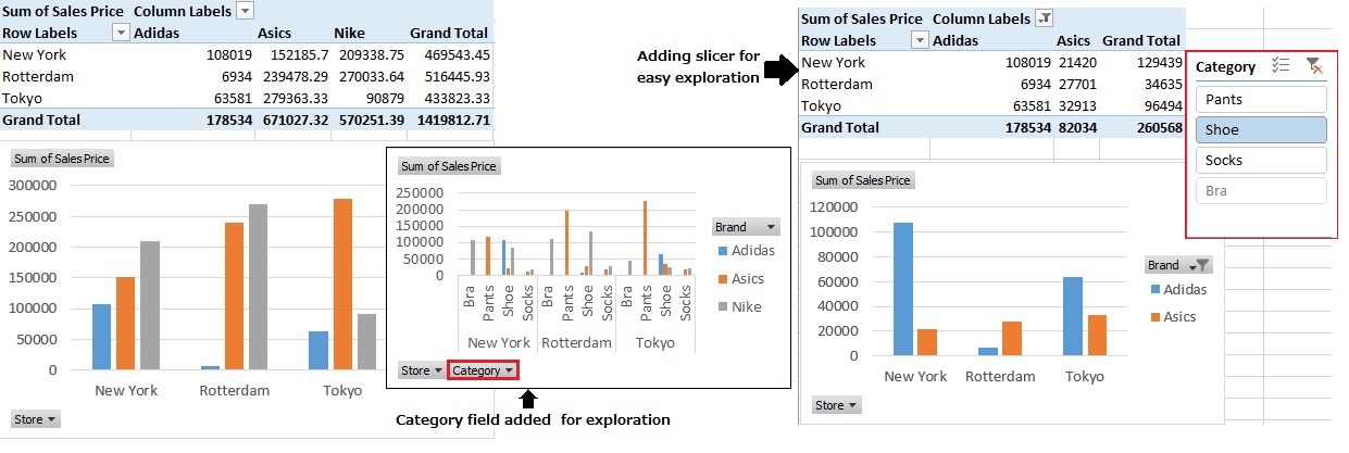
Here Pivot table and chart is used to analyze the data, wherein the left side table and chart gives us the whole picture of the sales at all the locations.The window at the centre shows us the addition of category field which can be used to manually select the data we need to display on chart/table, in case of minute analysis.The selection each time is time consuming and can be simplified by adding the slicer as shown on the right side.Just right click on any PivotTable fields item to select the “Add Slicer“. Once done, any category to be displayed on chart/table can just be clicked from the slicer selection which is very easy to do!
Power Pivot Data View
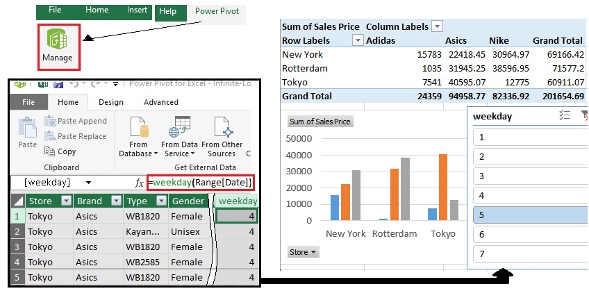
Let us suppose that we need to do further analysis of the data. Say, we need sales data of a particular day of a week.Slicer would be an option, but we need to select that particular day in every week of the month and this is again would be time consuming. Now, let me introduce an extra power of excel, i.e, power pivot.As shown in the above figure(left side), just typing in the formula in a single cell will populate the whole file.Just close the window and we have the extra column updated in the PivotTable field section which can be added as a slicer now for easy selection.
This is a simple example of descriptive analytics.
Working with multiple spreadsheets
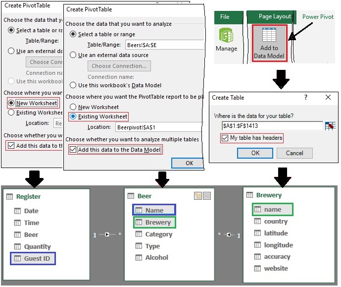
So far we have looked into the analysis of a single worksheet.Say, we have multiple worksheets in our file which are related and we need to pull out some data from one sheet to another.An easy way of implementing this would be to use the VLOOKUP, but we can expect the duplication of data in multiple sheets which is not good idea.The better way of doing this would be to “add things to the data model”.
Lets say we add two spreadsheets to the data model by placing the pivot in separate worksheets. We can easily filter out the contents of a single worksheet by selecting the appropriate items from PivotTable Field. Now in case we need to pull out the data from the other worksheet added to the data model. We need to go to all data(under PivotTable Field) and we see that in addition to the data from this worksheet that we are analyzing right now, also the information from the other worksheet is there, and this is because we have previously added this data to the data model. Now just select the needed items from the other worksheet to create a relation between the worksheets.But in some cases wherein excel isn’t able to create a relation automatically, we might get a pop up asking to create a relation between the items which we need to specify.
Power Pivot Diagram View
By now we have got a vague idea of the task completed till now. To make things much clearer, excel was actually working with power pivot all this time. So, lets move to power pivot and manage our data. We can already see all the data added to data model here. Selecting the ‘Diagram View’ at the top right we get the block view of each worksheet linking to each other. If we click the link, we can see the data connection which we have made.
In case we want to pull the data from one more worksheet, we can just move to that worksheet and select all the data and click “Add to Data Model” as shown on the right side of the above figure along with header selection in the next pop-up to create the new table in the diagram view of power pivot. After this there is no need to go to pivot table to create the relation, we can just click on the item of one block to create a relation with any item of other block on the diagram view. Now when we move to the pivot table, in addition to the other two worksheet data, the third worksheet data can also be seen. So just drag and drop to relate the data of the three worksheets. So, if we add everything to the data model and create the relations we can build a pivot table on top of that easily.
Data Tables / Dynamic Named Range with a Table & Others
Formulas are for calculation and not for analysis, however, there are some limitations to what you can do with pivot tables, because they don’t support everything and also they don’t really support scenario analysis. And that’s where you’re going to need conditional & array formulas.
Named ranges are used to avoid common mistakes like wrongly referenced rows or columns, omission of dollar sign in the references. Named ranges w.r.t rows/columns can be done just by selecting the particular row/column and directly inputting the name on the top left corner Name Box. However, named ranges are fixed ,i.e, any new inclusion to the source list will not be automatically referenced in the other sheet formulae. The answer to this is making the named range dynamic by utilizing the table functionality. Here for every new inclusion or deletion of a row in the source list, the row values become automatically a part of the Named range indexed by the first row header.
Dynamic Named Range with Table
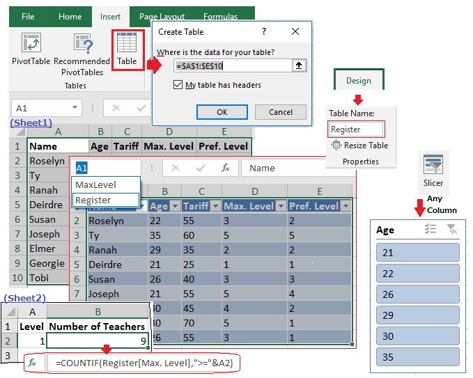
One of the biggest advantages to using a TABLE for a dynamic range is that you automatically have the ability to refer to each column, without creating additional named ranges. To create a data table, we need to first select all the data in our worksheet insert table right there. And then Excel asks us to select what data we would like in the data table and also whether or not our data has headers, after which all of these columns are automatically turned into something like named ranges, labeled by the first line or the headers. You can add slicers here to filter out the required data.
If we select our data table, we get an additional ribbon called ‘Design’ under which we can specify the Table name. In our illustration above, we have given the name as ‘Register’. This can be used in our formula on the ‘Sheet2’ along with reference to any column which acts as the named range and is dynamic as well!
Other useful excel functions
- In case you are provided with a spreadsheet with some complex formulas and you need to find out how the formula works, then use the “Evaluate Formula” option under the Formulas tab for debugging which is really helpful!
- Here let me explain array formula with some illustrations as follows;
=A1:A10 – B1:B10This formula gives the difference value of each row one at a time.
{=A1:A10 – B1:B10}This array formula gives the difference of all row values in a single cell . The flower bracket can be introduced by pressing the cntrl + shift + enter button. In case all the row cells are selected and the cntrl + shift + enter button is pressed after formula is entered, the array values will be displayed separately in different row cells.
{=SUM(A1:A10 – B1:B10)}This array formula gives the sum of, difference all the rows in the columns A & B in a single cell. - Transpose function array formula is mainly used when filtering is to be applied onto a particular row.
Here the point is to select the required number of rows & columns to be transposed on the result sheet and then hit cntrl + shift + enter button to get the result, otherwise the result will not be populated in all the cells. The example formula will look like :{=TRANSPOSE(Sheet1!A1:G9)}. Also, there is the method wherein “paste special” transpose can be used. However the disadvantage is that the destination doesn’t change when the source data changes.
Visualizing Trends
Earlier we learnt about data exploration. From our data we looked into the past of what happened to our data. But of course using data, we can also look into the future.We can determine using data: Where are we going? Are we on the right track, or should we maybe switch and start doing something else? Lets look at the various methods used to perform predictive analytics.
Conditional Formatting
Let us say we have extracted the text ‘Up’ into the trend column if the stock price has recently increased or ‘Down’ if it has decreased based on a threshold giving us an easy view of variation in stock prices. Inorder to further understand the trend of the total number of stocks(values column), summing of values column data based on the trend column data will give us the total count.
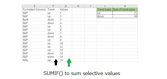
Here the Column K data is arrived at by using the SUMIF function which sums the column G data based on the condition of J column, the detailed formula is as follows: SUMIF(F:F,J2/J3,G:G)
Continuing with conditional formatting, we can use the colour scales under the “conditional formatting” button to do more powerful things. We can get a visualization that is wide with different colours. For example, just by looking into the figure below we can grasp a lot of information w.r.t the product cost per gender.
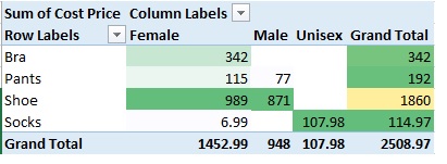
Colour Scales
Spark Lines
Some people might think it is visually not very attractive to have lots of colors on a spreadsheet, and there is some sense in that as well. So we will be learning an alternate way of exploring data ,i.e, the spark lines designed by a man called Edward Tufte.

Spark Lines
We can see tiny little graphs depicting the flow of data in each column. The “high point” in the graph is equivalent to the green cell in the table.So it is a really nice way of visualizing data, with multiple options like column and bar graph visualization as well.
Trend Plot
In the previous methods we were trying to understand what is in the data which is similar to sketching without knowing the real contents.Here i would like to present you with the real deal,i.e, make a real graph from the pivot table data on hand.
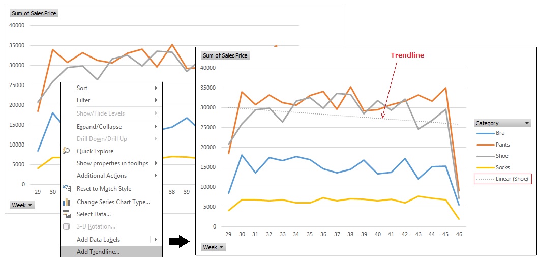
PivotChart & Trendline
We have added a PivotChart and we can play with our data. So if we look at ‘Shoe’, we thought the trend was that there was a little top in the middle, but overall it was flat.What Excel can do is add a trend line on the graph by right clicking on the ‘Shoe’ plot and then you see Excel is helping us understand our data, because even though there are some fluctuations the trend line seems to be somewhat going down.
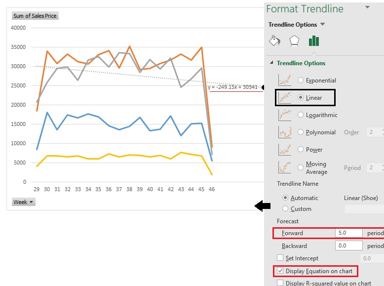
Format Trendline for prediction
We can make it even more interesting, because what we can also do is add a prediction. Now, the trend line continues even after our data. So we get a prediction for where our trend is going. We can use this trend line to make actual real predictions.If you select a trend line and right click… [Format Trendline…] we can edit the contents to predict for 5 weeks into the future. And what you can also do, that makes it really interesting, is add the equation on the chart. So if you put in the week number in the ‘x’ of the equation we can predict the amount of money we make on shoes, x weeks from now.
What-If Analysis & Solver
Till now we came to know about making predictions. Looking at the data and distinguishing the trend. Here we will see what actually has influence on the data ,i.e, turn the knobs of business to see its influence. So, let’s get started with the what-if analysis.
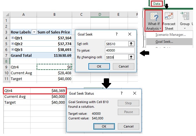
Goal Seek option
As shown in the figure above, let us first generate the pivot table of the raw data on hand. Here we are grouping the dates as quarters and we can see that we have the data of the first three quarters. Our task here is to find the data of the 4th quarter based on the target and the current average of the first three quarters. Using the “Goal seek” option of excel we can just set the cells and values appropriately to get the expected output of the 4th quarter automatically. If we are to do this manually it will involve a lot of formulae which is cumbersome.
In another method of making excel do the thinking for us, i would like present you with another excel tool called “Solver” which we can use to do the analysis like finding the maximum profit by automatically changing the input values.
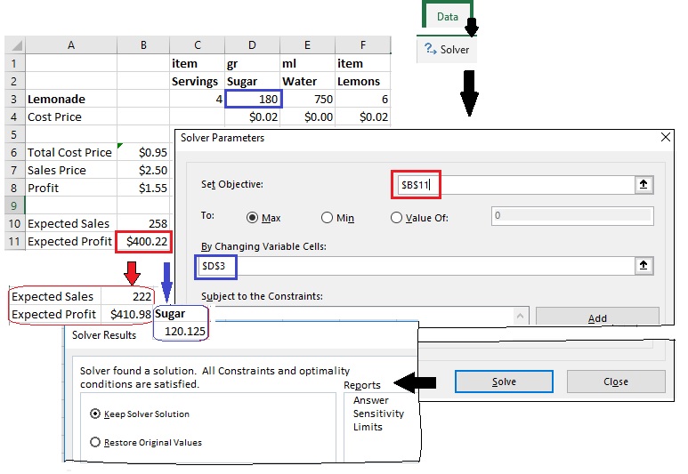
Solver tool
In case, Solver is not activated in your excel just go to File->Options->Add-ins[Manage:Select ‘Excel Add-ins’]->Go->Tick ‘Solver Add-in’ to activate the tool. Solver is more like the Goal seek tool but much more powerful because, we are not just saying we are looking for a goal. We can maximize or minimize values and take multiple cells into account.
As illustrated in the example dashboard above the Expected Profit & Sales are dependent on the amount of sugar we use, whereas the ‘Total Cost Price’ and ‘Sales Price’ are calculated by formulae(sumproduct) and vlookup on the sales info sheet respectively. By using the Solver tool we can check for the maximum profit we can obtain by the amount of sugar we use which is calculated automatically by the tool. In case profit is dependent on multiple items like water and lemons we can as well provide multiple inputs/cells to check for the maximum output.
Like the Goal Seek, “Scenario Manager” option is as well a part What-If Analysis button’s drop-down menu on the Data tab Ribbon. It enables you to create and save sets of different input values that produce different calculated results, named scenarios. After setting up the various scenarios for a spreadsheet, you can also have Excel create a summary report that shows both the input values used in each scenario as well as the results they produce. Using Goal Seek, we can only find one type of outcome, whereas scenario manager lets us see different types of outcomes based on a single set of data. Scenario Manager is usually used for sensitivity analysis.
Finally, spreadsheets just aren’t always the right solution and there are problems that you can come up within your work that are just not solvable with a spreadsheet. For example, a data analysis problem in excel requiring more VLOOKUP functions suggests that it is better to go for other tools to do analysis. Alternatives can be Excel VBA or Python. Since the current trend is Python and with a lot of freely available libraries, it is best to go with python.
Credits:
Online certification on Data Analysis
Experience


Leave a Reply