Data modeling is simple: when multiple tables are involved, we define relationships between them to enable complex data analysis. Many may not be aware that Excel has a built-in Data Model feature powered by the Power Pivot engine, which allows you to connect and analyze multiple tables without relying on messy VLOOKUP or XLOOKUP formulas. For large datasets, you can simply link related tables using common keys and analyze the combined data seamlessly through PivotTables. This approach makes data analysis more scalable, cleaner, and easier to maintain.
For those on the journey to learning Power BI, exploring this feature in Excel can be a great way to strengthen their understanding of data modeling and provide a solid boost to their Power BI learning journey.
Add to Model
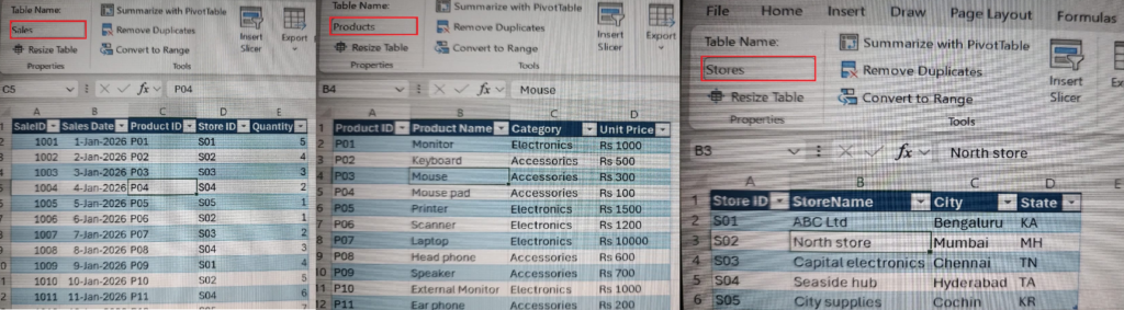
In this blog, I’ll demonstrate Excel’s Data Modeling feature using a practical example. To illustrate how it works, we’ll use the following three tables ,i.e, the Sales, Products and Stores tables.
Since we will be using PowerPivot, the first step would be to enable the feature if it has not yet be enabled. For this, navigate to File > Options > Add-ins and click on the Manage section dropdown and select COM Add-ins. Click on the Go button and in the next screen verify the “Microsoft for Power Pivot” option is selected and click on OK button. Now that Power Pivot is enabled, you can verify it by checking for the newly added tab.
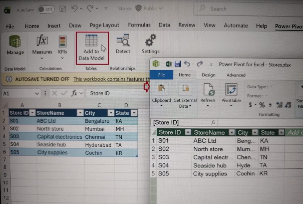
All the above three tables can be added to the model by opening the respective table data and navigating to the Power Pivot tab and clicking on “Add to Data Model” button option as shown below.
Once all the three tables data have been added to the data model, the following would be the final diagram view which will be visible under the Power Pivot > Manage > Diagram View option without the connections between them.
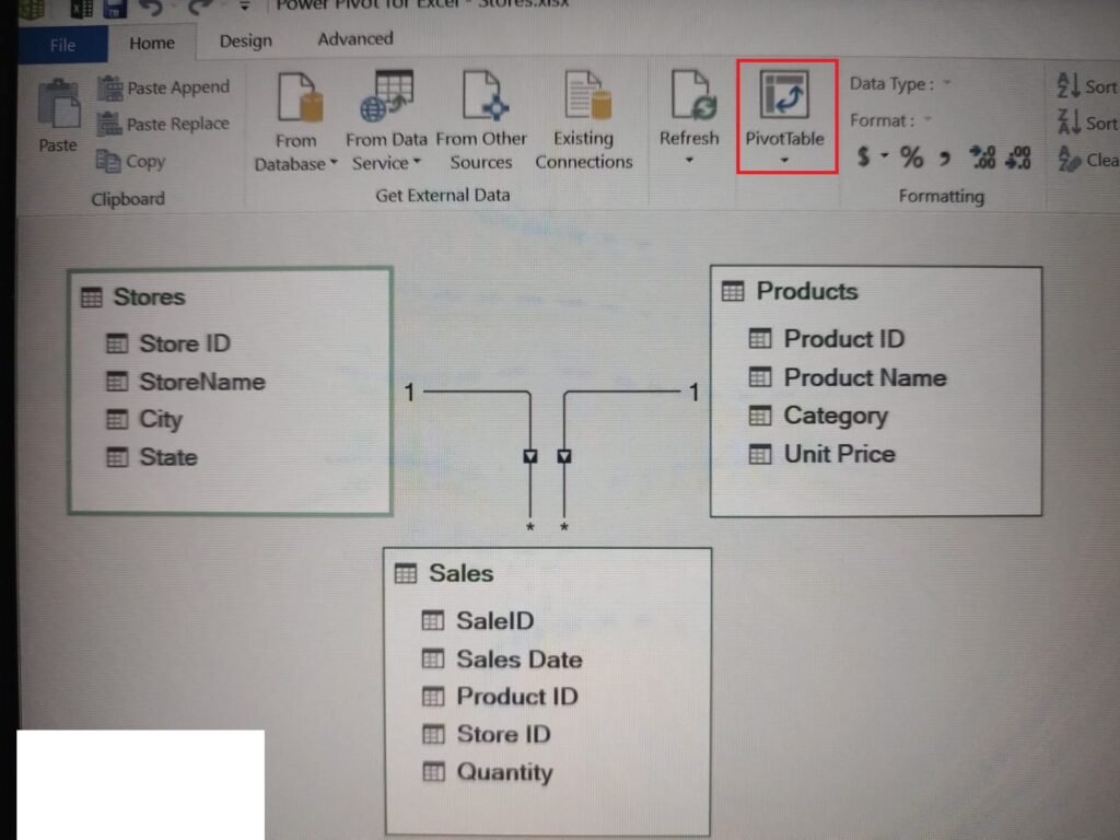
Make a connection between the Stores and Sales table data using the common matching column of Store ID. Similarly, make a connection between the Products and Sales table data using the common matching Product ID. Drag the matching column from the lookup/parent table (Stores unique values) and drop it onto the corresponding column in the data/child table (Sales) to form a one-to-many relationship. Similarly with the Products and Sales one-to-many relationship.
Pivot Tables & Slicer
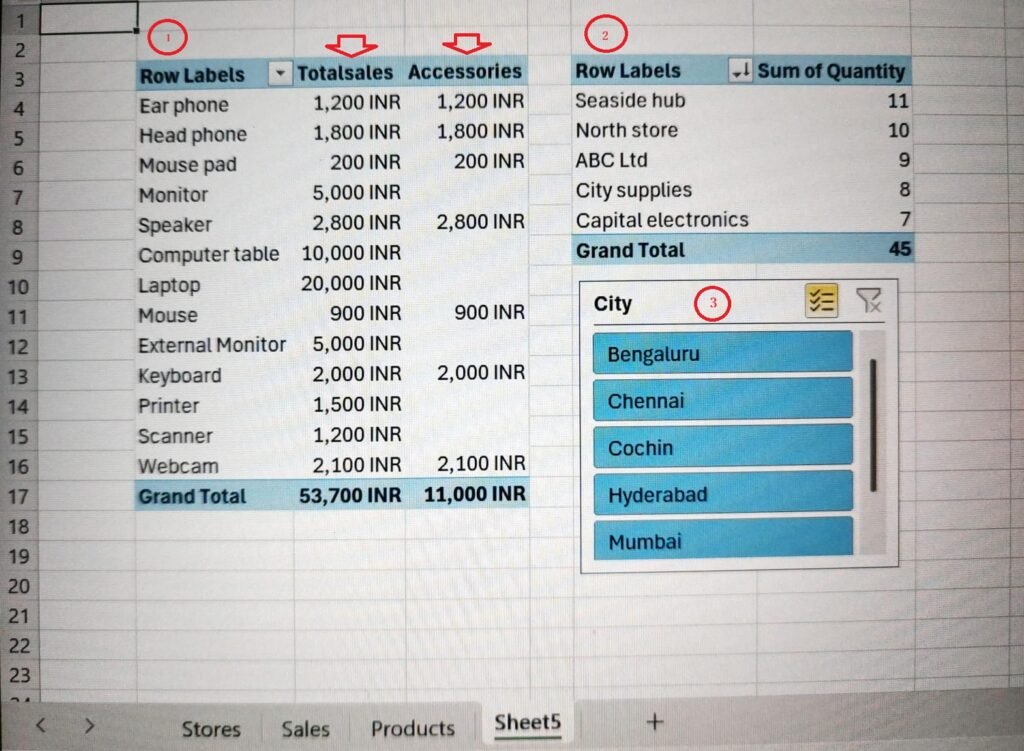
Once the connections between the tables are done as shown above, the next step would be to perform the necessary analysis. In this blog, we will discuss on arriving at the following two pivot tables ,i.e, 1 & 2 and the slicer indicated by number 3. To start with, click on the PivotTable button in the above view.
DAX Calculations
In order to display the left column of Product name in the above Pivot table(1), select the same from the Products table under the PivotTable fields. The next column of Totalsales is displayed using the Measures button feature.
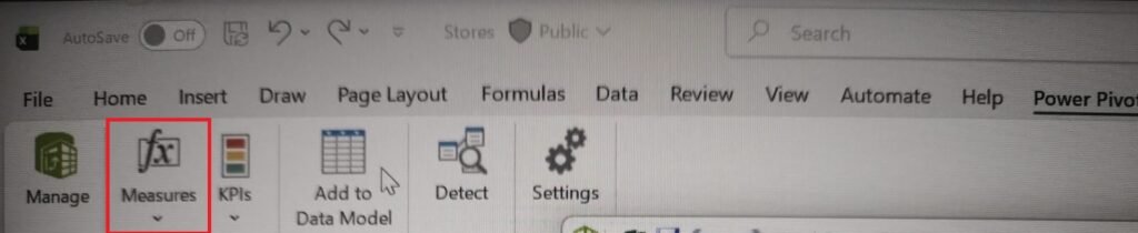
The Measures button on the Excel Power Pivot ribbon lets you create, edit, and manage explicit calculations using DAX formulas. Click Measures and pick either New Measure or Manage Measures, in our scenario you need to select New Measure as we are creating a new one.
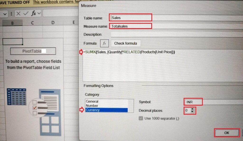
The below DAX formula is used to multiply each row in the Quantity column of Sales table with the corresponding Unit Price column rows of the Products table.
SUMX(Sales, [Quantity]*RELATED(Products[Unit Price]))
Select the Category as Currency and Symbol as INR with Decimal places set to 0 and click OK. The results will appear as shown in the pivot table(1) above under Totalsales column.
Since we have one more column next to Totalsales, i.e, the Accessories, we will explore on how to extract the information.
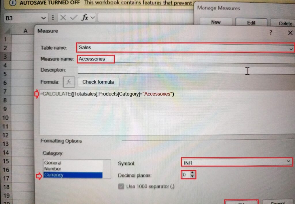
Under the Products table, we have a column called Category. If we want to filter the total sales based on a particular category, i.e, Accessories we will use the following DAX formula.
CALCULATE([Totalsales], Products[Category]="Accessories")
Select the Category as Currency and Symbol as INR with Decimal places set to 0 and click OK. The results will appear as shown in the pivot table(1) above under the Accessories column on the Final Dashboard.
Second Pivot Table
Till now, we arrived at the first Pivot table data. Next, we will move on to the second pivot table, where the data is output based on the connection between the Stores table and the Sales table data. Under PivotTable Fields, select the data to display in the PivotTable, i.e., StoreName from the Stores table and Quantity from the Sales table. The pivot table(2) will appear as shown in the Final Dashboard above.
Slicers
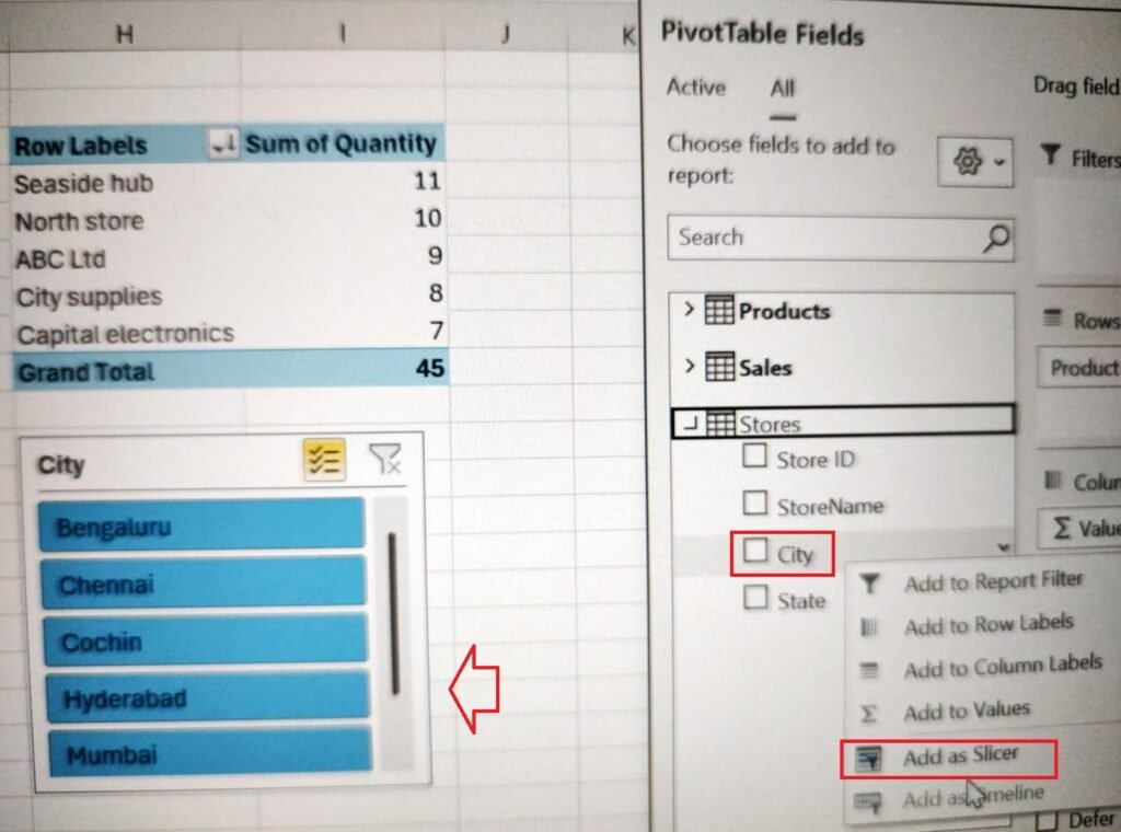
Now that we have both pivot tables ready, we will set up a slicer that filters both pivot tables data based on the slicer selection. The first step in setting up a slicer is to create one. As the slicer is setup for city, we will have to right click on the city item under stores table and select Add as Slicer as shown below.
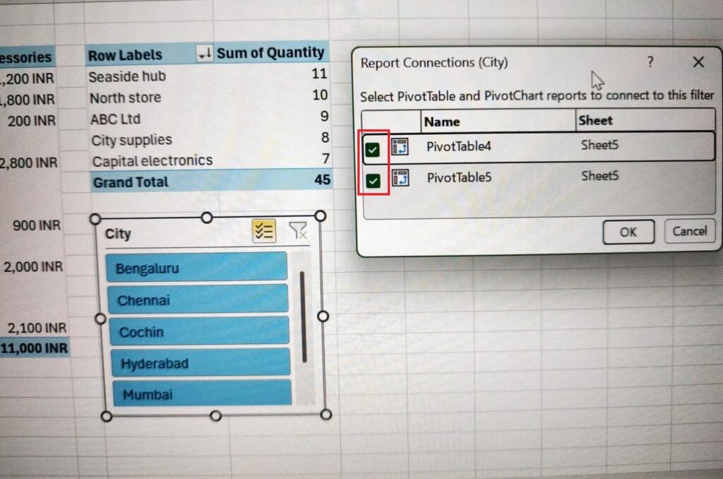
Right click on the slicer created and select the Report Connections option. All the pivot tables will get displayed under Report Connections. Since we will control the output of both pivot tables data by slicer selection, we will tick both the check boxes.
As an addition to the final dashboard, you can even add pivot charts to visualize the data in pivot tables.
Further Reading:


Leave a Reply