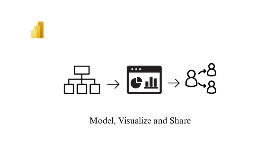
As mentioned in my earlier blogs, Microsoft Power BI is an interactive data visualization software product developed by Microsoft with primary focus on business intelligence. In this next post in the series on Power BI, i have tried to delve deeper into modeling, visualization and sharing aspects.
Power BI Components
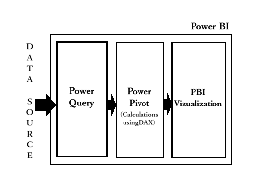
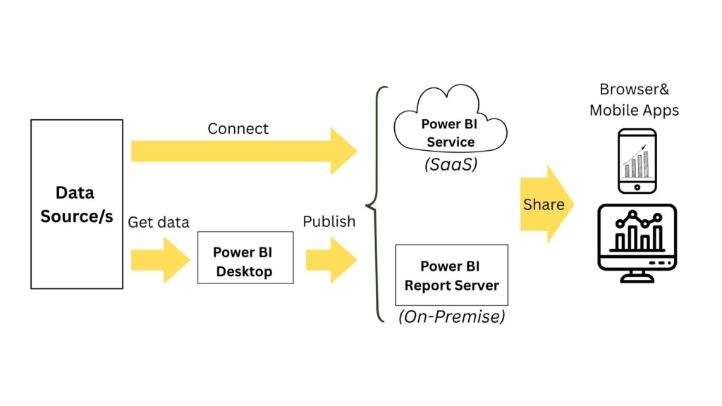
Power BI has two main components: Power BI Desktop and the Power BI service. Desktop is best for data modelling and report creation, while the service is ideal for sharing and collaboration. Both can connect to data sources and create reports. There’s also a Power BI Mobile app for viewing reports on the go. Key functional components include Power Query for data transformation, Power Pivot for modelling, and various visualization tools.
Power BI Desktop is a free Windows application that lets you connect to data, transform it, and create interactive visual reports that you can publish to Power BI service for sharing.
The Power BI service is a cloud based platform that enables users to create, share, and collaborate on interactive reports and dashboards. Dashboard is a collection of various graphs pinned from different reports. Users who consume and interact with the content in Power BI service are often referred to as end users, consumers, or business users. They primarily focus on interacting with and deriving insights from the content created by designers, enabling data-driven decision-making and collaboration within their organization.
As a Power BI service user with a free license, you explore content (such as reports, apps, scorecards, dashboards, and more) to make business decisions. That content is created by designers who have Power BI Pro or Premium Per User (PPU) licenses.
Refer to this link for clarity on the licensing.
Other Specialized Power BI Capabilities
Power BI Report Builder is the standalone tool for authoring paginated reports for the Power BI service.
Paginated reports are designed for printing or sharing. You can preview your report in Report Builder, then publish it to the Power BI service at app.powerbi.com.
Power BI Report Server is an on-premises report server with a web portal where you display and manage reports and KPIs. Power BI Report Server lets you keep reports on-premises, with the option to move to the cloud later. Like the Power BI service, you can connect to a variety of data sources. Power BI Report Server hosts Power BI reports (.pbix), Excel files, and paginated reports (.rdl).
Dataset and Data flow
Datasets are the objects that contain the connection to the data source, data tables, the relationship between tables, new columns , measures and the data itself. Datasets are the same as semantic models when used to explain the creation of reports and dashboards.
Dataflow is the data transformation component of Power BI, i.e, power query process that runs in the cloud and stores the data in Azure Data Lake storage or Dataverse. If you are consistently re-using same tables in multiple files, dataflow is highly recommended in such scenarios as a reusable ETL component.
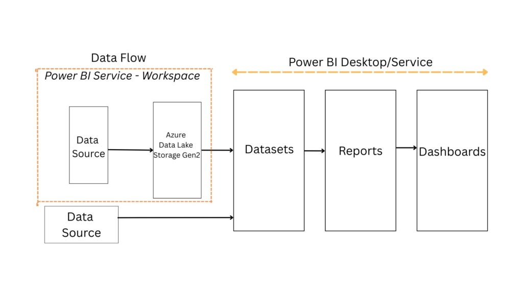
Table Storage Mode
Import mode is the most common mode used to develop semantic models. Import mode is to import data into the Power BI memory for storage. One of the main advantages of import mode is performance. Import mode is known for fast query performance because it queries data directly from memory. A Power BI semantic model can have data copied into it from the source during a refresh operation.
DirectQuery mode is often used in situations where the dataset is too large to load into memory. Models developed in DirectQuery mode don’t import data. Instead, they consist only of metadata defining the model structure. The semantic model can dynamically request data from a data source that it’s connected to using a method called DirectQuery. There is no need to refresh the model.
The Dual storage mode is a performance optimization. Dual-mode tables can act as Import for performance-intensive queries and as DirectQuery for real-time or query-specific needs. Power BI decides whether to query the local in-memory copy (Import) or directly query the data source (DirectQuery), depending on the relationships and query context.
Live connection is a method that lets you build a report in Power BI Desktop without having to build a semantic model for it. This type of connection is similar to DirectQuery because it won’t store data in memory. When you create your report in Power BI Desktop, you can connect it to a semantic model that already exists using the “Power BI semantic models” option under Get data. The options being, Azure Analysis Services database and on-prem instance of SQL Server Analysis Services.
Data Modelling
Data modelling or semantic modelling is setting up your data properly for visualization. This includes setting up tables, relationships, calculations and access for analysis scenarios. Use Power Query Editor to connect to one or many data sources, shape, and transform the data to meet your needs, then load that model into Power BI Desktop for further actions.
If you are to sketch how your data with different tables looks like, you will have a model with components as fact tables and dimension tables. Fact tables store numeric data like sales or order amounts and include foreign keys linking to dimension tables. Dimension tables provide context with descriptive details like product names or customer demographics. Fact tables are long with many rows and few columns whereas dimension tables have few rows and many columns.
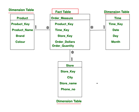
In most of the cases, we can see the cardinality or nature of relationship as many to one between a fact table and dimension table. Since dimension tables are the owners of the data we can expect such a connection. This is represented as a “*” next to the fact table and “1” next to the dimension table. In the model view of Power BI tool you can get to see the model view of your data.
A network wherein you have one central fact table and multiple dimension tables is called a star schema.
Once you load the cleaned data from a source onto Power BI, the tool automatically creates a model based on the similarity of the column names and data between the tables. Since some of the tables can be left unconnected, you need to navigate to the model view of Power BI to check on the connection between the fact and dimension tables and make a connection in case any dimension table is not connected.
DAX
DAX (Data Analysis Expressions) lets you create powerful calculations in Power BI, helping you analyze and visualize your data in new ways. DAX can be used to write formulas for calculated tables, calculated columns and measures in Power BI.
You can write a DAX formula to add a calculated table to your model. The formula can duplicate or transform existing model data, or create a series of data, to produce a new table. When your source data doesn’t include a date table, you can create one as a calculated table by using the CALENDAR or CALENDARAUTO` DAX functions. Date tables are required to apply special time filters known as time intelligence. DAX time intelligence functions only work correctly when a date table is set up.
You can use a DAX formula to create a calculated column in any table within your data model. A calculated column performs row-by-row computations and is stored in the model, making it available for use in reports and visualizations. You can also use DAX to create measures. Unlike calculated columns, measures are not stored in the table itself. Instead, they are computed dynamically at query time based on the current filter context in a report visual.
The key difference is that calculated columns are evaluated during data refresh and their results are stored in the data model (visible in Table view). Because they are physically stored, they increase the size of the *.pbix file. Measures, on the other hand, are calculated on demand and do not store results in the model, so they do not increase file size in the same way.
CALCULATE is one of the most important DAX function to be understood. Beyond that, FILTER, COUNT, MAX/MIN, SUM, AVERAGE, DIVIDE, ALL, NOT are all good for a very broad range of tasks. The syntax of CALCULATE is extremely simple. You invoke CALCULATE with an expression as its first argument, and a set of filters starting from the second parameter onwards. The format is as follows:
CALCULATE(<expression>, <filter1>, <filter2>, …)
An example would look as follows, wherein the sum of sales amount would be calculated only for Product A.
Product A Sales =
CALCULATE(
    SUM(Sales[SalesAmount]),
    Sales[Product_Name] = "Product A"
)
Visualizations
Before creating a visualization, several factors must be considered, the most important being the needs of the target audience, whether a visual can provide meaningful insights to the target audience and compatibility of the visual with the data. Understanding these requirements helps determine what visual should be used.
Build visual
Other than the commonly used chart visuals like Pie chart, Donut chart, Column chart, Bar chart, Line chart you can find the below few chart visuals that can be used in various scenarios.
- Card : The card visual in Power BI is a versatile tool for presenting summary measures in a visually appealing format. Each card can display a specific measure, such as total sales or profit growth, and you can customize it to reflect your objectives and key results (OKRs).
- Q&A : The Q&A visual provides a text box where users can ask questions about data using natural language.
- Decomposition Tree : The decomposition tree visual in Power BI lets you visualize data across multiple dimensions. This AI visual is valuable for ad hoc exploration and conducting root-cause analysis.
- KPI : Key performance indicator (KPI) visuals communicate progress made toward a measurable goal. They’re ideal for measuring progress and distance wrt a metric.
- Waterfall : Waterfall charts show a running total as Power BI adds and subtracts values. The initial and final value columns often start from the horizontal axis, while the intermediate values are floating columns.
- Key influencers : The key influencers visual helps you understand the factors that drive a metric that interests you. It analyzes your data, ranks the factors that matter, and displays them as key influencers.
- Ribbon chart : A ribbon chart combines ribbons for multiple categories into a single view. This visualization lets you see how a given category ranks throughout the span of the chart’s X-axis (usually the timeline) compared to other categories.
Parameters
Instead of building static reports that only answer one question, Power BI parameters lets you create dynamic, interactive visualizations that end-users can explore on their own. Think of a parameter as a variable or a placeholder you build into your report. It holds a value (like a number, a date, or a piece of text) that a user can select. When the user adjusts the parameter to any of the predefined values, the entire report – its data, visuals, and calculations – can update instantly based on that new value.
If you navigate to Modelling > New parameter > Numeric range / Fields , you will get dialog window for Numeric range or Fields respectively based on the selection as follows.
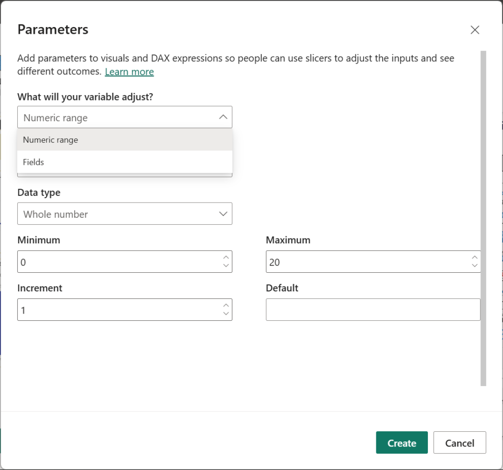
Numeric range parameters are typically used for scenario testing, where users adjust numerical inputs to see the impact on a given output. When you create a numeric parameter, Power BI generates two new measures: one to define the parameter and another to capture the selected value. Add slicer to the visualization by checking the option.
On the other hand, Fields parameters are used to seamlessly change the measures or fields used in a report visual. Add slicer to the visualization by checking the option.
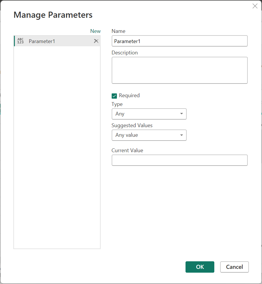
In Power Query, we have parameter called the Query parameter. To start creating a Parameter in Power Query. On PQ editor, navigate to Home > Manage Parameters > New Parameter. You can use Power Query parameters to store and manage values that can be reused. Parameters give you the flexibility to dynamically change the output of your queries, depending on their values.
Format page/visual
In this pane, you can create visually rich report tooltips that appear when you hover over visuals. You can link your Tooltip to your report by navigating to Format visual>General>Tooltips>On>Options, choose the Report Type & Page based on report pages you create in Power BI Desktop or the Power BI service. By creating a report page that serves as your tooltip (Format page> Page information > Allow use as a tooltip> On), your custom tooltips can include visuals, images, and any other collection of items you create in the report page.
Analytics
The Analytics pane lets you add constant and dynamic reference lines, error bars, forecasts, and anomaly detection to your visuals. Access the Analytics pane by selecting a visual and then selecting the Analytics icon in the Visualizations area. Without a visual in your report, the analytics pane will not appear.
Distribute a report or dashboard
Power BI offers several ways to collaborate and share Power BI reports, dashboards, and data with others, inside or outside your organization.
Workspaces are places to collaborate with colleagues on specific content. Power BI designers create workspaces to hold collections of dashboards, reports, semantic models and paginated reports. The designer can then share the workspace with colleagues. Designers can also bundle a collection of dashboards and reports into an app and distribute it to the entire community, to their organization, or to specific people or groups.
Everyone using the Power BI service also has a My workspace. Use My workspace as your personal sandbox where you can create content for yourself. You can see your workspaces in Power BI by selecting Workspaces from your navigation pane.
Roles
Roles let you manage who can do what in a workspace, so teams can collaborate. Workspaces allow you to assign roles to individuals, and also to user groups such as security groups, Microsoft 365 groups, and distribution lists. To grant access to a workspace, assign one of the following workspace roles to a user group or individual: Admin, Member, Contributor, or Viewer.
| Role | Access Level | Permissions |
| Admin | Full control | Manages workspace, users, content, settings, refreshes, and apps |
| Member | Broad content access | Creates and edits content, updates apps (if allowed), manages lower-level roles |
| Contributor | Content creation access | Builds and edits content, refreshes data, works with datasets |
| Viewer | Read-only | Views and interacts with reports and dashboards |
Endorse your content
Power BI provides two ways you can endorse your valuable, high-quality content ,i.e, Semantic models, dataflows, reports, apps to increase its visibility through promotion and certification.
Promotion : Any content owner or member with write permissions on the workspace where the content is located, can promote the content when they think it’s good enough for sharing within your organization.
Certification : Certification means that the content meets the organization’s quality standards and can be regarded as reliable, authoritative, and ready for use across the organization. Only authoritative reviewers (defined by Power Bi admin) can certify the content.
Further Reading :


Leave a Reply